WWE Network Interface Redux
If you know me, you know how much I love professional wrestling. (And if you don't know me, try out my handy new contact page and let's become friends.)
WWE is a brand always on the forefront of everything (not just pro wrestling), and 2014's launch of the WWE Network cemented their status as an innovative yet accessible worldwide media brand. I am a subscriber to the network and have been since its launch. It has thousands of hours of current and vintage content, and at least two nights a week, it's all we watch.
But here's the catch — the user experience design is terrible. So I decided to re-design it for myself. Because that's what I do.
(Update: The design I reference here as "terrible" was for the Amazon FireTV Stick interface, which, admittedly, is terrible. Other interfaces like Apple TV and PlayStation, the foundation of the re-design below, are better, but could still use a UX spruce-up. Hence all images below.)
$9.99 a month, y'all. First month is free. I am not a paid spokesperson. I'm just a wrestling nerd. Oh, and this is my homepage design. To see the current state of things, keep scrolling.
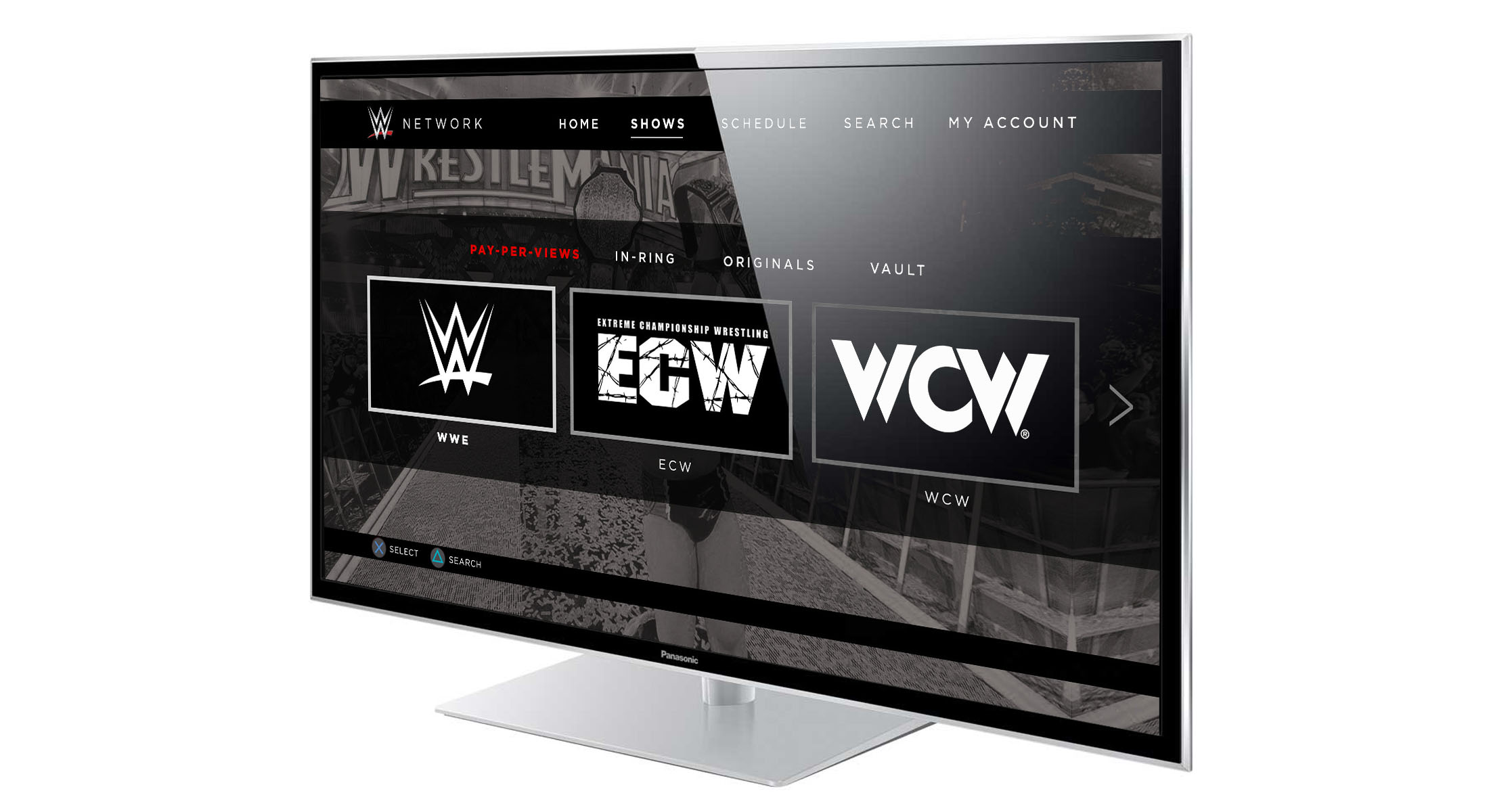
Using the app is always a bit of a rocky user experience for me. Even after almost three years, I have trouble finding my active place within the app due to the UX of multiple navigation bars and a confusing hierarchy between current, rollover, and visited states. This is the main issue I set out to solve with my makeover, and I made some aesthetic updates, as well.
This is the current design for the WWE Network. Any idea where you are on this page? Yeah. Me neither.
The new scrubbing navigation I've designed allows you to jump from match to match within a feature. This helps when you want to scrub through a promotional message without dipping too far into the main event. (Yay for skipping ads AND reducing spoilers!)
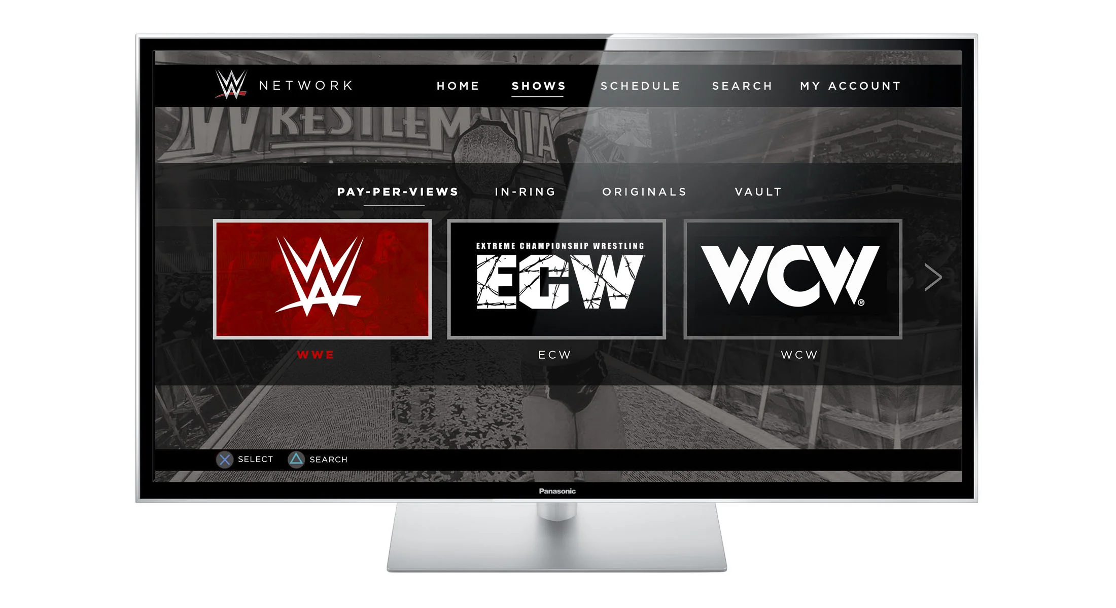
The platform can be accessed through streaming devices like Amazon FireTV Stick, Apple TV, or PlayStation, which is the user interface I chose for these designs. I created a more uniform navigation system that uses color changes and simple graphic treatments like underlines to allow the user to not only clearly see where their active "cursor" is, but also to easily be able to re-trace their steps through the platform.
This solves the problem I've had with the current layout, which uses red as both the "active" and the "visited" state treatment. I find that the use of red in the original design promotes these visited states upwards, rather than downwards in the UX hierarchy, often making me lose my place and wonder where I am on the page. In the makeover, red is solely reserved for showing where the user currently is on the page, with visited states now treated with a simple, white underline.
I've also updated the universal backgrounds and navigation to be monochromatic, which is a two-fold decision — 1) Reserving full-color imagery and text solely for the elements the user is currently interacting with limits the confusion of "Where am I?" and draws the eye to the active state. 2) WWE is a brand all about legacy and history, and the brand uses this platform as its vault of treasures. (The brand's current bumper slogan is "Then. Now. Forever.") Using this black and white imagery inspires this feeling of nostalgia, even when used with present-day images.
Most elements within the new interface design are dark with bursts of bright color, reminiscent of a WWE live event. When the lights go down in the arena, it's electric. And within moments, you're met with a fully lit jumbotron introducing one of your favorite Superstars or with a July-4th-worthy spectacle of bright, booming pyrotechnics. (Need proof? Scroll back up to that SummerSlam '16 thumbnail. Wowzers.)
All in all, the current state of the platform doesn't have a huge usability curve. I'm a frequent user and a huge fan of it, so this re-design is just as much an ode to its successful features as it is an attempt to improve its UX. (And any chance I can get to dip my design toes into the waters of my favorite brand, I'll take it. So I did!)
Thanks for joining me for this month's Makeover. I'll see you next month.


